Does your Moodle design include stunning photos? These 10 tricks will supercharge the photos you use and ramp up your learner engagement.
Photographs can be so powerful … capturing “real life” and focusing our attention on a single moment in time. One common mistake I see in courses is to think of the photos as window dressing instead of being critical to engagement.
[Tweet “Photos ARE content, not just window dressing. Use engaging images to reach your learners.”]
I’m going to give you 10 ways to use photos to get increased engagement in your course material.
To start off we need two things … a source for safe, non-copyright photos (not a Google Image search …), and a way to manipulate photos after we’ve found them.
Beginner Tools:

- Free Photo Sources: Unsplash, Pixabay or 123rf
- Easy Photo Editor: Google Slides (in your Google Drive, see here for a tutorial)
- Cropping tool: Mac (Command+shift+4) or Greenshot (read here about screenshots)
And now the tricks! ….

1. Size = Zoom
If your entire photo is going to be only a few inches on the screen, the subject has to be close up.
In other words, small photos need the subject to fill the frame. A photo that is gorgeous when you have it full screen, loses impact when it’s tiny. Especially, when it’s a far away shot with lots of things going on.
So, instead of this:
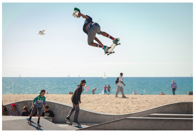
Try a more close up, simpler image … like this:

Both photos look great when they’re large. The second photo is much stronger when small.

2. The Rule of Thirds
One trick that photographers (and designers) use is to divide images into thirds and then place important focal points along them. It makes for a MUCH greater impact to have the subject to one side.
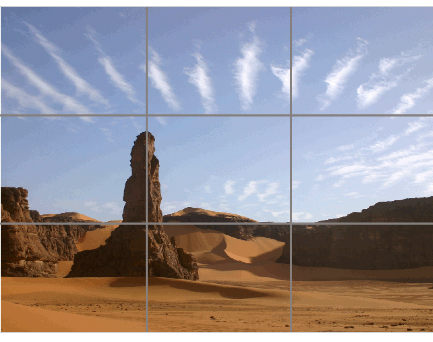
Photo from webdesignerdepot.com
“The idea is that placement along a third makes everything off-center, which creates visual interest. Centered content (text or images) tends to feel really balanced and formal (by that I mean really boring).” (Stephanie Evergreen)

Try and find photos with the main focal point off center or landing in one of the “thirds”.

3. No Stretching
One mistake that is almost universal is stretching an image to get it bigger. The result can be a blurry, pixelated image.


Notice that even the slightest bit of stretching
starts pixellating the photo?
Small images cannot be made bigger AND remain clear.
One problem with images (especially in a Google Image Search) is that they are an assortment of sizes and quality. MOST online images are designed to be smaller and lower quality so that they load faster online.
When you insert one of these smaller, low resolution images in to your course, you are lucky if the original is clear … never mind stretching it even bigger. There just aren’t enough pixels to keep it clear, the bigger and bigger it gets.
There are plenty of great photos out there. Find a bigger one and keep it looking snazzy.

4. Try it in Black and White
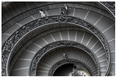
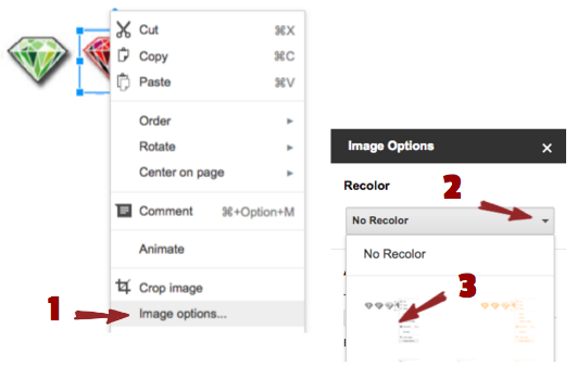
Don’t be afraid to include black and white photos. They add a lot of drama and visual interest. If you want to turn a colour photo into a black and white (or any other tone) try this in Google Slides:
I love black and white photos for thoughtful content, especially with people’s faces.

5. Play with Perspective (camera angle)
The most common angle for photos is straight on, at eye level. It’s also really boring, if that’s all you use. Try to include photos with different camera angles, and unexpected points of view:




6. Slice Them Up
This is a favourite trick of mine. I fall in love with photos and don’t want to show them off just once. Slicing them up lets you re-use them in different parts of your course.
Slicing … as I call it, is the process of taking a screenshot of only part of a photo. You can keep taking small screenshots of the photo until you have “sliced it up”.
It works really well if you have an amazing photo that can be “split apart” into a series. Here are some examples of photos I’ve split into slices …
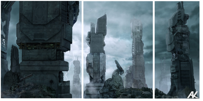 Photo by Adam Kuczek



These slices can be use in the sidebar of your course, or running along the side of a table of information. You can also slice horizonally, of course. Or, just grab a small portion of the image. They make nice “bookends” to your content.
Assuming you have the copyright to do so, you don’t have to leave the photo as a rectangle. (Another reason I recommend places like Unsplash and 123rf).

7. Frame it
Putting an image in a frame makes it look more dramatic and polished. This can be as simple as creating a black (or other colour) box and placing the photo in the center, like this:

You can also use creative shapes underneath the photo, bringing in other elements from the course. Like this:


I created these in Google slides by putting some colour (a rectangle textbox, a picture of a paint spatter, etc) as the first layer, and then putting a photo on top. Here is a tutorial of mine on how to work with images in Google Slides.

8. Pop on a Quote

Putting words on a picture makes them the focus of attention and makes them memorable. This is EXACTLY what you want for engagement with important ideas. You can use them to highlight quotes from people you are mentioning in the course, or pull a key sentence from the course material to highlight it.
See this great slideshow on using quotes:
Design Tool: Use Pablo, an amazing little tool that will have you creating photo quotes in less than 3 minutes. Seriously!

9. Build a Collage

(Templates from Picmonkey)
The great thing about collages is that they are visually appealing as well as creating an interesting relationship between photos. Just the fact the photos are all together makes them one “thought unit”.

(Photo collage from Picmonkey)
There are many collage-making websites out there but the easiest is probably Picmonkey. You can also choose swatches (fabric, designs, paper, objects, etc) making it similar to a scrapbook page. The photos can be altered using a variety of filters, giving you the option of black and white, 70’s lighting, retro look, etc. All very simple point and click. Try it out.

10. Run from Cliches

Boring, cliche stock photos. These are the real enemy of engagement. They are RAMPANT in online courses.
Here’s what I mean:
Anyone smiling direct-to-camera
Anything 3D looking
Anything involving a stack of old books
Anything written with a quill pen
Teens, who look like they are from a Sunday School picnic
… and apples, pencils, chalk boards, or other traditional “education” items
Just say no.

The Takeaway
Photos are powerful, super-engaging visuals to add to your courses.
There has been an explosion of websites offering gorgeous, artisan photos for you to use. Unsplash.com is my favourite place to find photos which are remarkable. The photos in this article are all from Unsplash, unless otherwise noted.
Have fun with them!
Do you have any image websites to share? Drop me a note in the comments below!
I’m going to give you 10 ways to use photos to get increased engagement in your course material.
To start off we need two things … a source for safe, non-copyright photos (not a Google Image search …), and a way to manipulate photos after we’ve found them.
Beginner Tools:

- Free Photo Sources: Unsplash, Pixabay or 123rf
- Easy Photo Editor: Google Slides (in your Google Drive, see here for a tutorial)
- Cropping tool: Mac (Command+shift+4) or Greenshot (read here about screenshots)
And now the tricks! ….

1. Size = Zoom
If your entire photo is going to be only a few inches on the screen, the subject has to be close up.
In other words, small photos need the subject to fill the frame. A photo that is gorgeous when you have it full screen, loses impact when it’s tiny. Especially, when it’s a far away shot with lots of things going on.
So, instead of this:

Try a more close up, simpler image … like this:

Both photos look great when they’re large. The second photo is much stronger when small.

2. The Rule of Thirds
One trick that photographers (and designers) use is to divide images into thirds and then place important focal points along them. It makes for a MUCH greater impact to have the subject to one side.

Photo from webdesignerdepot.com
“The idea is that placement along a third makes everything off-center, which creates visual interest. Centered content (text or images) tends to feel really balanced and formal (by that I mean really boring).” (Stephanie Evergreen)

Try and find photos with the main focal point off center or landing in one of the “thirds”.

3. No Stretching
One mistake that is almost universal is stretching an image to get it bigger. The result can be a blurry, pixelated image.
Notice that even the slightest bit of stretching
starts pixellating the photo?
Small images cannot be made bigger AND remain clear.
One problem with images (especially in a Google Image Search) is that they are an assortment of sizes and quality. MOST online images are designed to be smaller and lower quality so that they load faster online.
When you insert one of these smaller, low resolution images in to your course, you are lucky if the original is clear … never mind stretching it even bigger. There just aren’t enough pixels to keep it clear, the bigger and bigger it gets.
There are plenty of great photos out there. Find a bigger one and keep it looking snazzy.

4. Try it in Black and White

Don’t be afraid to include black and white photos. They add a lot of drama and visual interest. If you want to turn a colour photo into a black and white (or any other tone) try this in Google Slides:

I love black and white photos for thoughtful content, especially with people’s faces.

5. Play with Perspective (camera angle)
The most common angle for photos is straight on, at eye level. It’s also really boring, if that’s all you use. Try to include photos with different camera angles, and unexpected points of view:


6. Slice Them Up
This is a favourite trick of mine. I fall in love with photos and don’t want to show them off just once. Slicing them up lets you re-use them in different parts of your course.
Slicing … as I call it, is the process of taking a screenshot of only part of a photo. You can keep taking small screenshots of the photo until you have “sliced it up”.
It works really well if you have an amazing photo that can be “split apart” into a series. Here are some examples of photos I’ve split into slices …
 Photo by Adam Kuczek


These slices can be use in the sidebar of your course, or running along the side of a table of information. You can also slice horizonally, of course. Or, just grab a small portion of the image. They make nice “bookends” to your content.
Assuming you have the copyright to do so, you don’t have to leave the photo as a rectangle. (Another reason I recommend places like Unsplash and 123rf).

7. Frame it
Putting an image in a frame makes it look more dramatic and polished. This can be as simple as creating a black (or other colour) box and placing the photo in the center, like this:

You can also use creative shapes underneath the photo, bringing in other elements from the course. Like this:


I created these in Google slides by putting some colour (a rectangle textbox, a picture of a paint spatter, etc) as the first layer, and then putting a photo on top. Here is a tutorial of mine on how to work with images in Google Slides.

8. Pop on a Quote

Putting words on a picture makes them the focus of attention and makes them memorable. This is EXACTLY what you want for engagement with important ideas. You can use them to highlight quotes from people you are mentioning in the course, or pull a key sentence from the course material to highlight it.
See this great slideshow on using quotes:
Design Tool: Use Pablo, an amazing little tool that will have you creating photo quotes in less than 3 minutes. Seriously!

9. Build a Collage

(Templates from Picmonkey)
The great thing about collages is that they are visually appealing as well as creating an interesting relationship between photos. Just the fact the photos are all together makes them one “thought unit”.

(Photo collage from Picmonkey)
There are many collage-making websites out there but the easiest is probably Picmonkey. You can also choose swatches (fabric, designs, paper, objects, etc) making it similar to a scrapbook page. The photos can be altered using a variety of filters, giving you the option of black and white, 70’s lighting, retro look, etc. All very simple point and click. Try it out.

10. Run from Cliches

Boring, cliche stock photos. These are the real enemy of engagement. They are RAMPANT in online courses.
Here’s what I mean:
Anyone smiling direct-to-camera
Anything 3D looking
Anything involving a stack of old books
Anything written with a quill pen
Teens, who look like they are from a Sunday School picnic
… and apples, pencils, chalk boards, or other traditional “education” items
Just say no.

The Takeaway
Photos are powerful, super-engaging visuals to add to your courses.
There has been an explosion of websites offering gorgeous, artisan photos for you to use. Unsplash.com is my favourite place to find photos which are remarkable. The photos in this article are all from Unsplash, unless otherwise noted.
Have fun with them!
Do you have any image websites to share? Drop me a note in the comments below!

Leave A Comment