A common (and completely wrong) assumption about online learning is that simply putting a kid in front of a computer will make them shiver with excitement at whatever you are trying to teach them. In fact, you have pretty stiff competition from everything ELSE they’re doing online. Trust me on this one, your lesson on Class Hierarchy in Edo Japan is never going to be more engaging than the parade of grumpy cats just posted on their Facebook friend feed. In the past, students were willing to separate how they learned from how they lived. This is no longer the case.
Creating engaging, memorable lessons is not impossible though, but first we need to bust the 3 biggest myths.
Myth #1: Online Learners Love to Read!
Despite the urban legends floating around out there (reading has increased online, only some kids are visual learners. etc.) most text longer than a TWEET is often getting skimmed over. While it’s true that the total amount of text consumed may be significant, it’s getting delivered in smaller bite-sized pieces. The old adage is true. Less is more. Meaning, less text is more engaging. The trending is towards visual learning. This means that long monolith-like text blocks aren’t getting read.
My advice? Try these tips for your next lesson:
-
Be a relentless editor.
Cut whatever you just wrote in half. It isn’t a textbook.
-
Record yourself reading or explaining the most important concepts.
Nothing is sweeter than a voice, especially when it’s reading to us. Try directly recording into YouTube, or screencasting.
-
Start with the Lead.
Don’t make ’em wait for it. Think newspaper, not Harry Potter.
The first hurdle is to let go of to all those beautiful words you spent hours carefully choosing. Yes, 70% probably need to go bye bye. You don’t have their undivided attention for long. The best choice, where possible, is to focus on delivering Essential Outcomes, returning several times to the key points.
Myth #2: It’s hard to measure engagement.
Actually, it’s getting easier than ever to get indications which learning pieces are getting great responses.
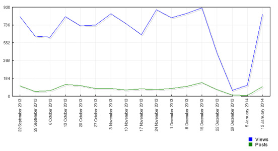
In Moodle, and many other CMS, there are lots of stats available (Admin tab –> Reports). It’s a humbling (and really valuable) process to look at the “peaks and valleys” in your courses. You can’t manage what you don’t measure.
Myth #3: My course doesn’t have to be “pretty”. What’s really important is the information.
While it’s true we aren’t all graphic designers, that doesn’t get us off the hook in terms of offering an engaging online course that looks like our classroom (colourful, clean, and human). We are engaging minds that respond to visual presentation, both teens and adults. It’s not fluff to represent information visually, or be conscious of the amount of white space in your course. To add some visuals to your course, here are a few quick places to check out:
- Canva.com
This is really THE place to quickly add visuals. - Flickr: Creative Commons
It’s hard to know in a Google search if the artwork you find is stolen, free or someplace in between. Flickr’s online community submits art for free (creative commons) use. - http://www.informationisbeautiful.net/
Data visualization sounds scary but is really just a cool way of showing information visually. Careful … you may spend hours gazing at the graphics there! - http://visual.ly/
It’s an infographic paradise. Or, if you prefer to tackle making your own, set up a free account at infogr.am. - 123rf (Stock Photos)
I use this site a lot, as I’ve found it to be the cheapest source of stock photos for my courses.
I’m a big fan of recognizing your areas of strength, and outsourcing the areas that are not. If the design area is not, don’t worry and don’t give up. Become a magpie of other people’s great stuff online. Meanwhile, get your red pen and start thinning out your text blocks. You just might find a few more “peaks” in your student engagement.
Have I forgotten another Myth?
Drop me a note below! I’d love to hear from you.


Leave A Comment